Analyse media language/visual codes of 5 different posters

Dark Crimes (2018)

Dark Crimes.jpg

This film poster uses a dark background to link to the film title “Dark Crimes”. This is also shown with the placement of the tagline “It takes a dark mind to solve a twisted crime”, being positioned on the main actors head. The shot of Jim Carrey is placing his face in lighting which makes his surroundings and clothing seem dark and twisted, therefore linking to the theme of the film. Jim Carrey has a serious facial expression to convey a sense of threat as Carrey plays the role of a “hard-boiled detective” who invesigates murders in correlation to an author’s hit novel. The text is written in white to suggest the important nature of the plot, the font for the title “Dark Crimes” has fingerprints to further reinforce the genre of the film.


Nightcrawler (2014)

nightcrawler

The Film Poster places the text at an angle at the bottom of the poster to show the important parts of the image. It shows a long shot of the main character to consequently produce excitement for the film as he is a recognisable actor. The font is written in yellow to symbolise a road. The tagline “The city shines brightest at night” links to the plot where the main character captures violent crimes in Los Angeles. The main image is dark as it portrays LA at night, there is a juxtaposition between the colours of the foreground image in contrast to the colour of the car. There are also enigmas produced in the background with the street lights which continue into the distance.


The Godfather (1972)

the godfather

This film Poster uses the main image in low key lighting to represent the main character as powerful, and therefore the harsh lighting reflects his personality. The lighting also has a golden tint to represent power and wealth which mobs and mafias have. This is reinfored by the title “The Godfather” which is written in a compact font in gold, it also depicts a hand playing the role of a “puppetmaster”, showing the sense of control that he has. The background is black to fade the dark clothing of the character.


22 July (2018)

22 july

This film poster uses a normal setting to symbolise how this could happen to anyone, the contrast between the theme of the film and the “welcome” to sign show the unsuspecting people arriving at the island, knowing that they couldn’t escape. The tagline “The true story of a day that started like no other” is written in black compared to the rest of the text to place the settig in a relatively normal location to reflect the sense of shock the attack had. The sky is shown as cloudy to represent this sense of doom that the children encounter as well as the helicopter in the sky which is featured in the film. The text “22 July” is in a news style ticker tape to convey the news “breaking” as the film reflects true events which took place in Oslo, Norway in 2011.


Spectre (2015)

spectre

This film poster uses highkey lighting on the faces of the actors to therefore highlight the significance of the main characters. Daniel Craig is placed to dominant the film poster which reflects his characteristics in the film. The film is relatively simple and plain to inforce the popularity of the franchise. The background is from a shot at the beginning of the film during a day of the dead parade in Mexico City.

Statement of Aims and Intention

In my media production, I will utilise media language by including connotations of the crime genre with the use of police cars and crime scene tape on the DVD covers and film poster. I will also include the names of previous work by the directors and actors for fans of those films to want to see it.

On the teaser film poster, I will include the two main characters with the protagonist positioned in the middle for affect, the shots will be meduim long shots with serious facial expressions to suggest an element of danger and seriousness to the film. The film poster will also include the tagline “Trust no-one, including yourself” to therefore generate the storyline of being set up, and the theme of trust in the film. The poster will also include “coming soon” to create hype for the film. The DVD Cover will also include a close up shot with the main character including high key lighting to symbolise the time of day most of the film will be set in, it also exaggerates the characters serious facial expression.

The representations of the characters will be constructed through the ‘issue’ of black under representation in the british film industry. I will also include a feminist element to the film by having two of the three main characters as women. Through David Gauntletts theory of representations, the main character will construct an element of personal identity to the audience as a role model (U&G). Stereoytypes in the film will be tackled by created a strong black female lead in the film who defies these presumptions.

My target audience are 16-21 year olds of an ethnic minority background who can relate to some of the issues referenced in the film, including racism. For viewers at this age, they are constructing ideas of future careers and encourages this niche audience to consider roles within the police (with the main character acting as a role model) to therefore make a difference in british society. The film is set in Brighton, which targets most young people from an urban area as well as appealing to this alternative audience by representations from an afro-central point of view. The film will look at the issue of police corruption and how it is often overlooked by blaming the innocent. The film generates a storyline as a perspective of the main character being set up by the people above her (generating a sense of police superiority). The concept of agesim is also created through the police superiors as well.

Digital convergence is a way in which we consume and interact with different media products. I will also include inside the DVD covers links to the official film website, and links to the production company (Warp Films) social media links to appeal to the younger audiences as well as opportunities to find other films made by the same production company that has the posibility to appeal to them.


Treatment (research and planning)

Warp Films Production

Working Title:

Genre: Crime film

Director: Steven Knight

Duration: 1hr 30m

Target Audience: 16-21 year olds within an ethnic minority background seeking a personal identity, mostly female due to the strong black female lead. This will relate to the feminist element and addressing stereotypes (with ethnic minorities as well as under representations of the black community in British film). The alternative audience would be young people considering roles within the police (as there are references to the AC units in police). The main character will develop a role model for the audience. The film is classified as a 15 certificate, this is because at this age, many young people are deciding what they want to do with their career paths.

Outline: Main plot (in relation to Todorov’s narrative theory)

  • Equilibrium- Amana is working as a police detective in the police. When one day, the next door neighbour (a drug dealer named Miguel) gets busted by the police. At the time there is a a large scare and presence of the likelihood of a terrorist attack in Brighton (Amana is investigating these outcomes). There are previous scenes showing Amana helping the struggling drug dealer overcome his problems, by bringing his groceries round etc.
  • Disruption- During the raid of the neighbours house, the police find links between Amana and the drug dealer (from notes and receipts round the house.) Later on, they discover links between a terrorist group planning an attack in Brighton & hints that they are being tipped off by corrupt police officers. (houses are empty during police raids)
  • Recognition- The only person Amana trusts is her best friend and co-worker Hershey, whilst the media are publicising her as a corrupt police officer. Amana discovers the link between the terrorist group and her superior (Patrick Chester)
  • Resolution- Scenes show the terrorist group preparing an attack with the Prime Minister in Brighton (the media coverage show the Prime Minister arriving in Brighton as Amana watches the television): Amana phones Hershey with the link and the armed response teams arrive at the scene and intercepts the terrorists. Whilst still on the phone to Hershey, Amana arrives at the scene to discover Patrick Chester in handcuffs.
  • Re-Equilibrium- The film ends with Amana and Herhsey watching Sky news with scenes of Patrick being arrested and put in prison with Amana being awarded for her courage and promoted to her superior role.

Character Breakdown:

MAIN CHARACTER- Protagonist (played by Freema Agyeman)

Name: Amana Ssenga

Age: 21

Race: She is of Ugandan heritage, yet both her parents have lived in England all their life. She grew up in Brighton and still lives in Brighton

Gender: Female

Profession: Police Officer (always dreamt about being within the police since she was young and experienced crime as a child) She is relatively young to be within the police but excelled academically.


MAIN CHARACTERS BEST FRIEND (played by Archie Panjabi)

Name: Hershey

Age: 24

Race: Asian British

Gender: Female

Profession: Police Officer


ANTAGONIST (played by Tom Hardy) 

Name: Patrick Chester

Age: 30

Race: White British

Gender: Male

Profession: Police Sergeant (links with terrorist and organised crime)


Visual Elements:

There will be police stations, cars and uniforms used throughout with scenes in the police office with background actors/actresses in costume. There will also be scenes out in the street as well as in Amana’s, Miguel’s & Hershey’s apartments. The lighting in these shots will be more highkey and lighter scenes to signify daylight as most scenes are shot during this time.

Audio Elements:

In the trailer for the film, the song “Running with the wolves” by AURORA plays in the background, this connotes the links to being chased by the ‘wolves’ (superiors)


ISP 16: Film ‘Issues’

What ‘issue’ are you integrating into your narrative? Explain how your film idea reflects a social, cultural and/or political context? (200 words)

I will be integrating the issues surrounding the stereotypes on women in the black community and film industry by projecting a strong black female lead to go against these stereotypes. With the ending of the film having her as more powerful than ever, and creating a general form of personal identity and icon for the audience to relate to. I want to do this because there is a lack of this representation in the British film industry currently. The film will address the issue of police corruption and how it is often overlooked by blaming the innocent.

There will also be an element of feminism by having the main character’s best friend being the only person to believe that she’s been set up, whilst the rest of the department believes she is guilty. The film presents the storyline as a perspective of the main character being set up by the people above her (creating an idea of police superiority), as well as an insight into how mistakes can be made in the police and the subsequent consequences. By having the film set in Brighton, it reinforces these stereotypes. An element of an agesim concept is shown through the police superiors as well.

Crime Film:

  • My idea is to have a crime film about a police detective who is set up by the rest of the police department- set in Brighton.
  • The ‘issue’ targeted in the film would be positive representations of a black female lead (+ feminist element) as well as addressing the issue of different stereotypes.
  • My audience would be 16-21 year olds of an ethnic minority who are considering roles in the police and therefore generate a positive representation and role model. Representations of afro-central British point of view with appeal to a more niche audience

Characters:

  • MAIN LEAD PROTAGONIST- Amana (faithful and loyal Swahili meaning) Ssenga- Police Detective who is set up
  • BEST FRIEND- Hershey- supports and believes Amana whilst the media and police are against her.
  • ANTAGONIST- Patrick Chester- corrupt police sergeant


Component 3: Coursework

Independent British film company: Warp Films

What types of films do they make (+examples)?

  • Ghost Stories 2017 (Drama/Horror)
  • This is England 2006 (Drama/Indie Film)
  • ’71 2014 (Drama/Thriller)
  • Dead Man’s Shoes 2004 (Drama/Triller)


  • This is England
Budget: £1.5 million
Box Office: £5 million
  • Submarine
Budget: £1.5 million
Box Office: £3.8 million
  • Four Lions
Budget: £2.5 million
Box Office: £4.3 million


Film Posters Codes & Conventions

Promotion: known places for film posters include bus stops, billboards, on buses, the underground & cinemas.

You also have to look at capturing the publics eye with the poster, creating enigmas through the use of colour, lighting and other media elements

Icons have an important role with understanding the genre of the film.

Image: Always contain some form of iconography,

Directors, Producers and actors: usually when the director/actor is well known, the names are displayed on the poster are often the main selling point of the film.

Quotes, Recommendations and Rating: Once a film has been screened to critics, the promotion team of a film can re-create posters or
re-cut trailers to include positive reviews, ratings, feedback and recommendations

Awards: Similar to reviews and feedback, when films or actors are nominated for awards- these can be included in the details

Tagline: Taglines are used to hint about what might happen and convey the genre and plot of the film.

Date, Rating & extra info: There are different types of dates
posters can use, they can be precise and use the exact date, or put the month, season or a
simple ‘coming soon’ if the film is still in production.One of the most important parts of a film poster is all the small print information which contains
the name of the director, producers, actors, soundtrack, production company, screenplay, and more, as well as the rating, a website link to find out more- this information is often small as it is not interesting to the audience.

film poster codes and conventions

Features on DVD Covers-

  • Movie name
  • Age Ratings
  • Ratings and reviews
  • main actor/actress
  • insight into the plot
  • film production company name
  • credits

Task-

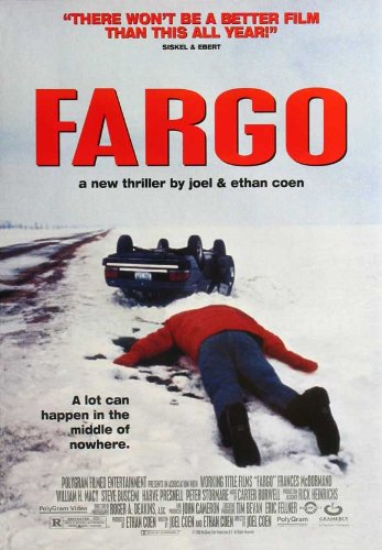
Image result for Fargo film poster

The Fargo film poster conveys the genre through the main image with the use of blood and the tagline “A lot can happen in the middle of nowhere”. The film is set in Minnesota which can be shown through the reference to “nowhere” and snow. The actors in the film are not shown in the poster which suggests that the actors are not well known.The title colour is in red which connotes blood reinforced by the dead body and crashed car. The film includes small credits which references the actors/actresses. The review at the top of the image is the same colour as the title, this is done to hype the film up and to make the public want to watch it. The film follows a true story of events which took place in Minnesota in 1987. There are multiple teaser trailers for the film which depicts the same message to the audience. The main colour scheme is white and red which portrays the setting and conditions which

Image result for fargo film teaser postersImage result for fargo film teaser posters

Tinderella Film Poster

  • I like the scrapbook and doodle style of the poster which connotes a teenage girls life as well as the play on words with Cinderella and tinder.
  • However I don’t like the emptiness and small doodles and the unclearness of the release date.

Expecting A Gift

  • I think that the colour scheme is really good as well as the font gives off a professional overall effect and the positioning of the text is well thought out.
  • I think that it could possibly be improved by changing the background colour to white, however I think that the current colour works really well.

The Demon at Night

  • The colour scheme works by linking the title colour to the blood.
  • I think that there are too many ratings and it is too crowded, the actors names clash with the background.

Representations- Week 15 ISP

Task One

Identify the four stereotypes about women according to Jeremy Tunstall

  • Domestic
  • Sexual
  • Consumer
  • Marital

Apply these stereotypes to the front cover, features and advertisements in the July 1965 Vogue. Which stereotypes are prominent?

  • Front Cover- The representation of women on the front cover is showing the consumer by promoting the products. In relation to race, it shows the cover to be exotic through the use of makeup and the Turkish headwear.
  • Feature: ‘Money: Questions and Answers’- The article focuses on consumers by writing a feature dedicated to money and money saving, therefore suggesting that the reader needs help and advice in relation to the subject.
  • Advert: ‘Revlon: The applied art of eye-making’- This advert references consumers because it is promoting products to the reader and suggesting for them to buy it.
  • Advert:’ Cutex: bare essentials’- The advert focuses on a consumer as it promotes the lipsticks as well as the image being sexualised through the use of “bare essentials”.
  • Advert: ‘Imperial Leather’- The advert focuses on the domestic reader as it portrays a caring mother looking after her child, it therefore suggests a form of family home, which may also relate to marital.
  • Feature: ‘Picnics Probable and Improbable’- There is a representation of a domestic household, with images depicting a family together, there is also a marital use with the sense of security within the family home- this is shown with the anecdote of Antonia Fraser’s own family memories.
  • Fashion Feature: ‘Heatwave Holiday: Clothes new in the shops now’- These selection of images represents the consumer side of the magazine, with the fashion feature including lists of the products for the reader as well as references throughout the feature of ‘holidays’, suggesting that the reader has a disposable income.

Task Two

Use the Vogue July 1965 pack to answer these questions:

What messages does the Vogue magazine convey about female beauty?

The magazine conveys a message of ‘this is how you should look’ to the audience. It produces aspirers through the use of expensive clothing and other items as well as targeting readers that can afford that expense. The features in the magazine all include models wearing heavy makeup, a common theme throughout the magazine, suggesting that natural beauty isn’t the main focus of the photoshoots. The front cover includes Sophia Loren wearing extreme makeup, this portrays a sense of the reader having access to these luxuries as they are promoted throughout. The magazine images include predominately white models, showing the ideal female image as corrupt as it is not an accurate representation.

How is female beauty defined?

Female beauty is defined in the magazine as being wealthy enough to afford such luxury items. In relation to the front cover, it uses Turkish headwear which represents the model as exotic, however this could be considered as cultural appropriation in modern society as they have not included a Turkish model. The expensive jewellery and headwear is also reinforced by the feature focusing on money, portraying a form of status that is exhibited through female beauty. The front cover and Heatwave Holiday feature both define women as independent through the use of media language. The advertisements in the magazine focus on either makeup or skin care, suggesting that the overall health of a woman is not important and that she should look a certain way. However, the imperial leather advert is different because it focuses on caring mothers and therefore the use of makeup is not necessary.

How is the reader positioned in relation to the representations that the magazine offers? Are the models, stars or celebrities who feature in the magazine constructed as aspirational figures?

The representations of the models throughout the magazine offer an insight into the aspirers. The front cover includes an image of Sophia Loren presented as powerful by the size of the image, she is seen as someone to look up to for the reader. Sophia is wearing expensive earrings and clothing suggesting that her status is defined by money, she is also a successful actress which creates a form of personal identity and aspiring between the reader and the model. All the models in the magazine also offer personal identity for the audience as they are there to be looked up to. The magazine also makes it clear that money is important through the articles with the ‘question and answers’ article connoting a form of status and superiority. However, the magazine also underrepresentation of black models, this can be seen with the only ethnic minority representations are in the background of the images, representing them as inferior. The advertisements which feature in the magazine are promoting makeup, suggesting that a woman should care more about her appearance than health.

To what extent does the magazine define a woman’s value in terms of the way she looks?

The race underrepresentation sees non-white readers feeling irrelevant and unimportant as the magazine does not focus on the beauty of different ethnicities. With the magazine not being diverse, this creates a form of racism in the media industry towards the idea of ‘female beauty’. The magazine also defines a woman’s value with the exclusion of natural beauty and the overrepresentation of makeup, creating a sense of insecurity for the reader as not reaching societies expectations. However, it could be argued that the ‘Imperial Leather’ advertisement breaks these standards by suggesting that skincare is more important and presents a loving mother and child relationship as more important instead.

Magazine- Representation

Define the term ‘socialisation’

The process through which we learn the norms and values of our culture. (e.g. gender socialisation refers to the way in which we learn what is expected of us as men and women).

What messages do women’s magazines convey to women?

There is much critical debate in relation to women’s magazines and the representation within them. Women’s magazines convey a form of identity for the reader, about who they are expected to be as well as what it means to be a woman.

David Gauntlett’s theory of identity

The theory of identity argues that the representation of gender that circulate in media products are more diverse than previous generations.

According to the theory, the media provides us with tools and resources to constructing our own identities. Rather than being manipulated by the media, Gauntlett suggests that we take a pick and mix approach.

In analysing the magazines representations of gender you should make sure that you address the following questions:

  • Does the magazine support Gauntlett’s claim that in the past media representations offered singular, straightforward messages about the ideal types of male and female identities?
  • To what extent do the representation in your set magazine differ from those found in women’s magazines today?

Notes (pg 168-171)

There are many stereotypes in relation to media, the ‘happy housewife’ is a common stereotype with a long cultural history. The housewife is a representation especially during the 1950s & 60s that ‘stays at home’ and ‘looks after the children’ whilst the husband figure is working.

Representations of Female Beauty

Readers are encouraged to evaluate their own physical appearance, therefore measuring themselves against the ideal beauty type presented in magazines. Rather than promoting self-confidence, magazines often work on these insecurities and create anxieties for the reader.

Readers are invited to prove their femininity by participating in the rituals of the beauty community. Magazines frequently suggest that should the reader fail to invest the time, money and effort in her physical appearance that she runs the risk of losing her femininity.

Consider these issues when you analyse your set magazine:

  • What messages does the magazine convey about female beauty?
  • How is female beauty defined?
  • How is the reader positioned in relation to the representations that the magazine offers? Are the models, stars or celebrities who feature in the magazine constructed as aspirational figures?
  • To what extent does the magazine define a woman’s value in terms of the way that she looks

Representations of Race, Ethnicity and National Identity

In various women’s magazines it could be argued that the under-representations that ethnic minority groups are often presented in magazines. Furthermore, the few black celebrities who feature in mainstream women’s magazines are sometimes said to be whitewashed through the editing process or lighting set-ups. Races are often shown as exotic and treated as an object that are visually satisfying.

Does the Vogue (1965) reinforce traditional gender stereotypes of the time?

It could be argued that the front cover of the Vogue 1965 cover goes against traditional gender stereotypes by presenting a woman of the ethnic minority group. She also is presented as the main image as a form of liberation, her image is constructed as a sense of empowerment for women in general. The shot connotes power with the direct eye contact with the camera as well as her facial expression being serious. On the other hand, she is being represented as exotic, which is reinforced by the Turkish headwear and makeup. This then represents different races as purely objects and are only respected from a beauty perspective.

Throughout the magazine, there are adverts subjected to the stereotypical female reader. Makeup and skincare products are advertised in the magazine which strongly relate to a female audience. The Cutex lipstick advert directly address the audience by asking “Are you woman enough to wear them?”, reinforced by a large image of a woman with gentle and feminine connotations. These can be seen with the pink and yellow colour palette to connote nature linked with “summer” as well as the story of Adam and Eve. This reflects 1960s beliefs of women being photographic opportunities and not seen as independent people.

In the Revlon advert it defines “Making eyes has always been a great feminine art”. This shows that makeup is seen as a strictly feminine talent that excludes men and compliments the talents of women. This also portrays women as needing instructions in able to do makeup. During the 1960s, this was a common belief that women roles were to look after the children and be models, this was not believed that men could do the same. This can be reinforced by the Imperial Leather advertisement which plays on the role of the ‘mother’ in the household, reflecting the 60s view of women’s expectations.


Vogue July 1965 Audiences (ISP14)

Task One-

Create a demographic and psychographic profile of the target audience of the July 1965 edition of Vogue, based on the articles and advertisements featured in your magazine pack

The main image is of a woman which reflects the target audience directly. The inclusion of extreme makeup and clothing which, during the 60s, is considered a style that predominately women would utilise. She is wearing this makeup to generate a form of personal identity between the audience and the model (Uses & Gratifications) and also represent to the audience a ‘model’ of beauty due to the use of excessive makeup. It is clear that the target audience are mainly women which relatively high incomes of the ABC1 social status, which is shown through the use of luxury items throughout the magazine and is not considered a necessity. This is reinforced by the iconic and recognisable Vogue logo on the front, which is in a neat and sophisticated font. She presents an idea of dominance for the reader by being the main and only subject of the front cover, linking with the emerging form of feminism during the 60s. The headwear used on the front cover originates from Turkey, representing the exotic aspect in relation to races. Therefore the target audience are women that are up to date with the latest fashion trends as well as celebrity figures.


The readers of the magazine want to use it as a source of information on new fashion trends so the clothing in the magazine are of luxurious quality and finish which further connote the upper class and income status of the reader. Shelia Black’s article focuses primarily on money, and the issues that are generated through money, she also directly talks to the Vogue readers by calling them “intelligent” and “most of them were happily free of financial problems, that a number were definitely rich”, this makes the reader feel good about themselves as well as reinforcing the idea of empowerment with women which is also shown through the front cover. The next article is about picnics, an activity which involves families, this generates an idea of the target audience being actively involved within their family, whether they are the mother or a wife. The article talks about Antonia Fraser’s memories and experiences with picnics as well as direct mentions of her own mother. The last article talks about summer clothing and connotations to going on holiday are shown through images including suitcases, directly suggesting the target audiences are able to afford such luxuries. The images include captions which describe to the reader the clothing pictured, implying that these items are affordable to the target audience.


The adverts focus on typically feminine activities such as makeup and skincare. The first advert “Revlon: The applied art of eye making” also pictures a woman with the main focus on her eyes. This reflects 60s believes of women being primarily beauty figures and are therefore focused on only looking good. The advert includes Revlon products with a tutorial on how to achieve this look. It mentions “Making eyes has always been a great feminine art. But never has a woman had so many utterly devastating (and easy to use) products at her command”, directly addressing the middle/upper class audience as having access to these luxuries. The next advert is the “Cutex bare essentials” lipsticks, the repetition of “essentially” in the naming of the products illustrate the necessity to own these items as well as the reinforcement of the target audience having a disposable income. The advert also includes a picture of a woman with the description of the products as “warm and womanly” with the rhetorical question “Are you woman enough to wear them?” The last advert (Imperial Leather) targets nurturing mothers with the large image of a mother and her child is attempting to personally direct the reader into buying the product through emotional response.

Task Two

Define the hypodermic needle theory

The Hypodermic needle theory implies that the media has a direct impact on its audience, and the effects on society. The theory which was created in the 20s (and developed in the 30s after the use of propaganda in WW1), suggests that information is ‘injected’ into audiences.

(The mass media in the 1940s/50s were perceived as a powerful influence on behavioural change.)

George Gerbner’s Cultivation theory

George Gerbner’s Cultivation Theory suggests that the regular exposure to repeated patterns over long periods of time can influence the way in which people perceive/view the world (cultivating particular social and cultural attitudes).

Women’s magazines are linked with Gerbner’s theory, they use repeated patterns of representation in relation to maintaining gender norms.

Discuss the ways in which Gerbner’s theory differs from the hypodermic needle theory.

The hypodermic needle theory and Gerbner’s cultivation theory both offer insights into more ‘passive’ audiences and their reactions to the mass media. However, the theories differ in relation to Gerbner’s cultivation theory focuses on the effects of long-term media exposure (whereas the hypodermic needle theory implies that the media products have an immediate effect on audiences). It also suggests that the audience views are shaped by patterns of representation, rather than single media products in isolation.